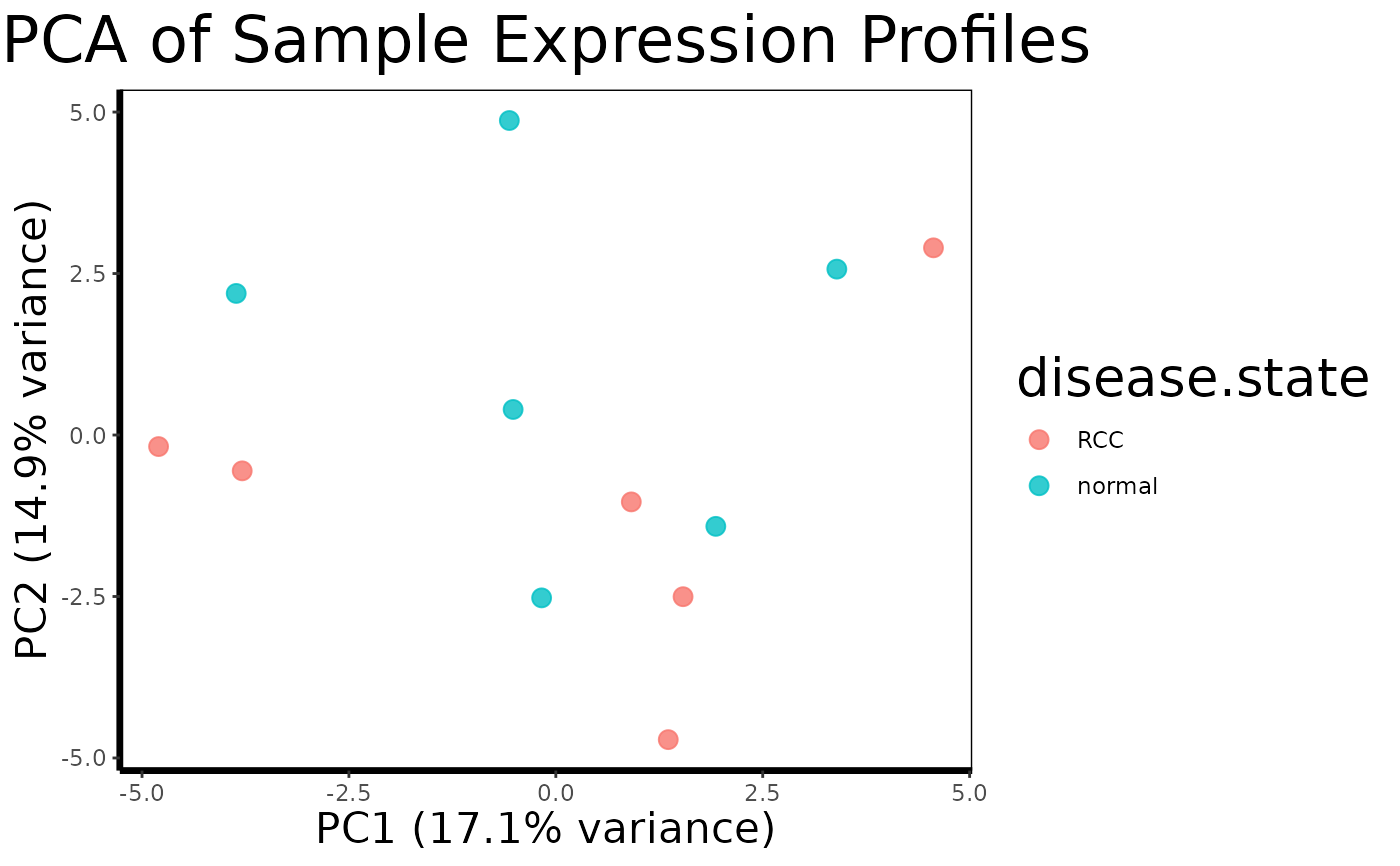
Reduces the dimensionality of the full expression matrix using Principal Component Analysis and plots samples in the first two principal component axes, colored by a phenotype variable. Useful for quality control, batch effect detection, and exploratory assessment of sample clustering.
Arguments
- expression.matrix
Matrix of gene expression values. Rows are probes, columns are samples.
- phenotype
Data frame of sample metadata, as returned by
extract.expression()$phenotype.- color.by
Character. Column name in
phenotypeto use for point coloring. Default is"disease.state".- scale
Logical. Whether to scale probes to unit variance before PCA. Default is
TRUE.
Value
A ggplot object showing samples as points in PC1 vs PC2 space, colored by the specified phenotype variable. The percentage of variance explained is shown on each axis label.
Details
PCA is typically applied at the whole-dataset level before any gene
filtering, making it a useful first diagnostic after load.geo.soft()
and extract.expression(). Tight clustering of samples by disease
state in PC1/PC2 space suggests a strong and detectable expression signal.
Unexpected clustering by batch, sex, or other covariates can indicate the
need for covariate adjustment in downstream run.limma.de() models.
Examples
# \donttest{
# Create a synthetic expression matrix (50 probes x 12 samples)
set.seed(42)
expr.mat <- matrix(rnorm(600), nrow = 50, ncol = 12)
rownames(expr.mat) <- paste0("probe", 1:50)
colnames(expr.mat) <- paste0("sample", 1:12)

# Create a matching phenotype data frame
phenotype <- data.frame(
  disease.state = rep(c("normal", "RCC"), each = 6),
  row.names = paste0("sample", 1:12)
)

pca.plot(expr.mat, phenotype, color.by = "disease.state")

# }
# }